Bayer AG Introduces a Groundbreaking Women’s Health Brand: WOMEN | Bayer
Bayer AG, the renowned German pharmaceutical and life sciences company, has unveiled a groundbreaking initiative in women’s healthcare with the launch of WOMEN | Bayer. This innovative brand aims to “dispel myths and misconceptions, simplify complex topics, delve into the unknown, and illuminate the overlooked and misunderstood,” with the ultimate goal of addressing the gender health gap.
A Brand Built on Purpose
The most successful brands often possess a clear sense of purpose and individuality that elevates their identity. WOMEN | Bayer effectively marries its rich heritage and expertise with a forward-looking vision, showcasing how a well-crafted design can elevate a new brand’s emergence in the market.
Crafting the Identity
Developed by the award-winning global brand design agency Design Bridge and Partners, WOMEN | Bayer’s unique identity stems from an in-depth analysis of the gender health disparity. Katherina Tudball, Senior Creative Director at Design Bridge and Partners, explains, “Women receive healthcare in a world designed by men, filled with taboos, misconceptions, and stigma due to significant gaps in research, data, information, care, and trust. Half of the world’s population—representing all walks and stages of life—feels neglected by the medical system, united by what is missing. We set out to visualize these gaps.”
Designing a Symbol of Health
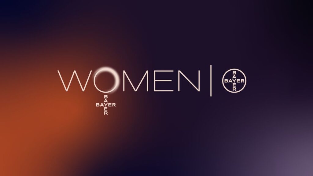
At the heart of this brand identity is the logo, which incorporates the iconic ‘Bayer Cross,’ long recognized as “a symbol of health.” Katherina remarks, “For more than 90 years, this logo has illuminated Bayer’s hometown in Germany as a massive, glowing sign. The ‘Leverkusen Bayer Cross’ spans 51 meters in diameter, making it the largest trademark in the world.”
“Drawing inspiration from this historical symbol of illumination, we created a new beacon for women’s health. By representing gender disparities as shadows and darkness, the WOMEN | Bayer brand aims to shed light on women’s health concerns, dispelling myths and illuminating truths that have often been disregarded,” she adds.
A New Visual Language
The updated logo features an illuminating ‘O’ that reflects the theme of ‘enlightenment.’ Katherina explains, “A soft glow on the ring’s edge embodies the idea of enlightenment, which is also showcased in custom typographic elements and animated graphics. The overall identity utilizes light as a visual metaphor, highlighting constructive solutions while acknowledging the shadows of unresolved issues.”
Color Schemes for Depth and Optimism
In the creative process, Katherina shares, “We explored numerous color palettes before finding the right mix of depth and optimism.” The final gradient palette of purples and golds intentionally avoids stereotypically gendered colors. Katherina notes, “Once all the design elements aligned conceptually, the design process flowed seamlessly with a singular focus.”
Women’s Health: A Personal Mission
Katherina emphasizes, “While I personally find the logo’s symbolism gratifying, the driving force behind this brand and its ambition to foster meaningful change is what truly excites me. Working on WOMEN | Bayer has illuminated how poorly women understand their bodies and how systemic sexism persists within healthcare systems.”


